01The problem
What was broken
The earlier homepage introduced the summit through a text-led banner, while programme, speaker and booking information were less prominent in the main navigation.

A commercial event website redesigned around its audience, programme and next steps, with a distinctive homepage and clearer ticket and sponsorship routes.
The earlier homepage introduced the summit through a text-led banner, while programme, speaker and booking information were less prominent in the main navigation.
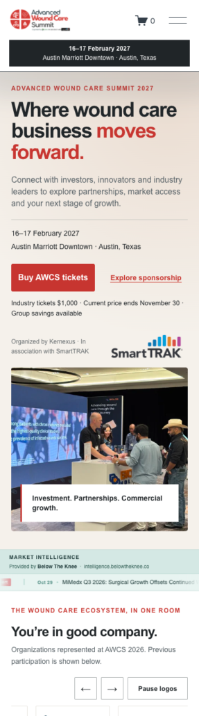
We reworked the homepage hierarchy, business-focused messaging and visual presentation, added direct programme and speaker navigation, and brought ticket and sponsorship actions into a clearer visitor journey. The redesign keeps AWCS’s red identity and uses real event photography.
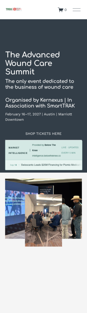
A redesigned public website with a clearer commercial proposition, programme and speaker routes, and prominent ticket and sponsorship actions. The desktop and mobile views show the delivered changes in presentation and navigation.
A commercial summit needs visitors to understand who it is for, what they can gain and how to take part. Clear audience messaging and distinct next steps support that decision across desktop and mobile.
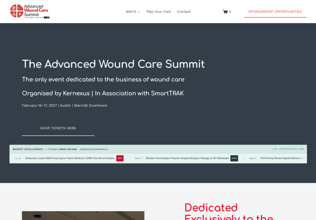
Desktop homepage before the redesign, captured 19 September 2026. A text-led banner and compact navigation introduced the event. Mobile views follow below in before-and-after order.
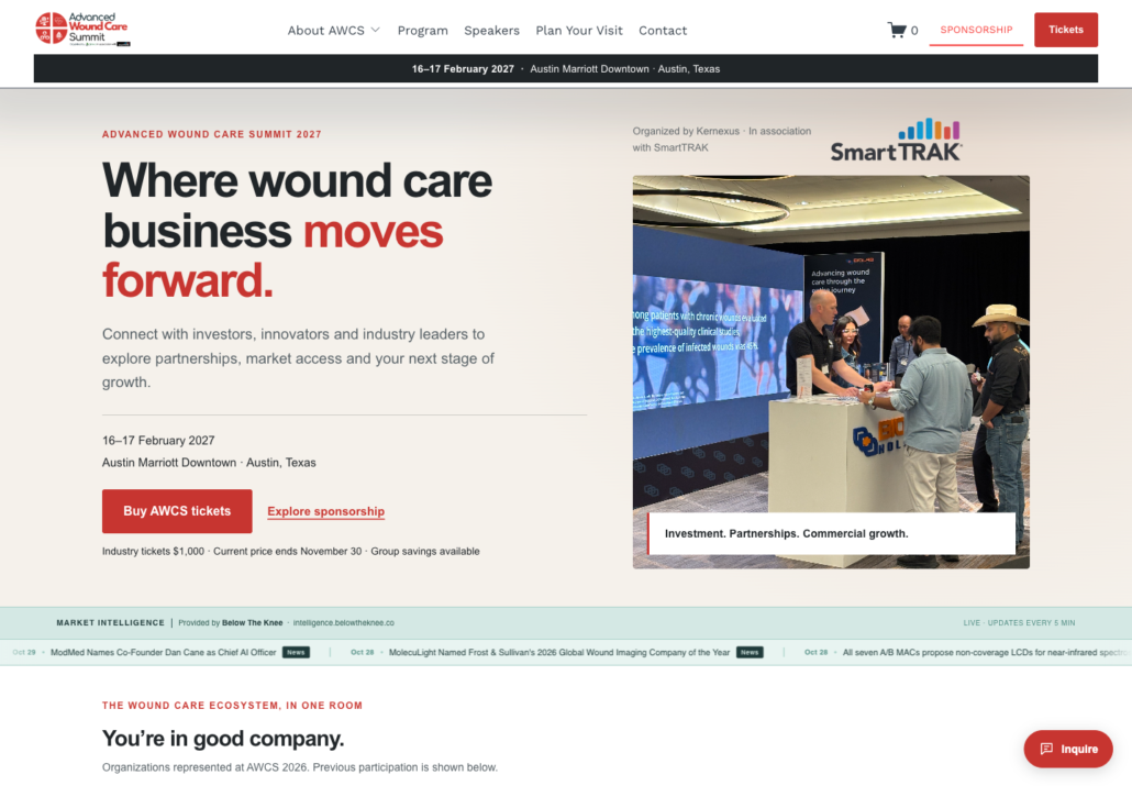
Desktop homepage after the redesign, captured 2 November 2026. A business-led headline, event photography and direct routes to tickets and sponsorship define the opening screen.
We can map the bottleneck, prioritise what to fix first, and tell you honestly whether EKN is the right fit.

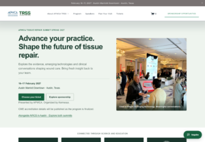
 TRSS: a clearer attendee journey
Needed for security, accessibility, and core site functionality. These are always on.