01The problem
What was broken
The earlier homepage led with the event name, accreditation messages and a dense image banner. Programme, faculty and ticket information needed a more visible place in the visitor journey.

A clinical event website with a clearer proposition, stronger programme and speaker discovery, and distinct routes for attendees and sponsors.
The earlier homepage led with the event name, accreditation messages and a dense image banner. Programme, faculty and ticket information needed a more visible place in the visitor journey.
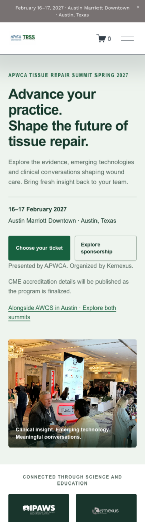
We restructured the homepage around the clinical audience, introduced a clearer opening message and event photography, and made programme, speaker and ticket routes more prominent. The redesign keeps the APWCA TRSS green identity while separating attendee, sponsorship and AWCS crossover choices.
A redesigned public website that explains the clinical proposition, makes programme and speaker discovery easier, and provides clearer ticket-category and sponsorship pathways. The before-and-after views show the delivered website changes.
Clinicians, researchers and industry visitors need different information before deciding how to take part. The website brings the programme, audience relevance and practical next steps together, with a consistent experience across desktop and mobile.
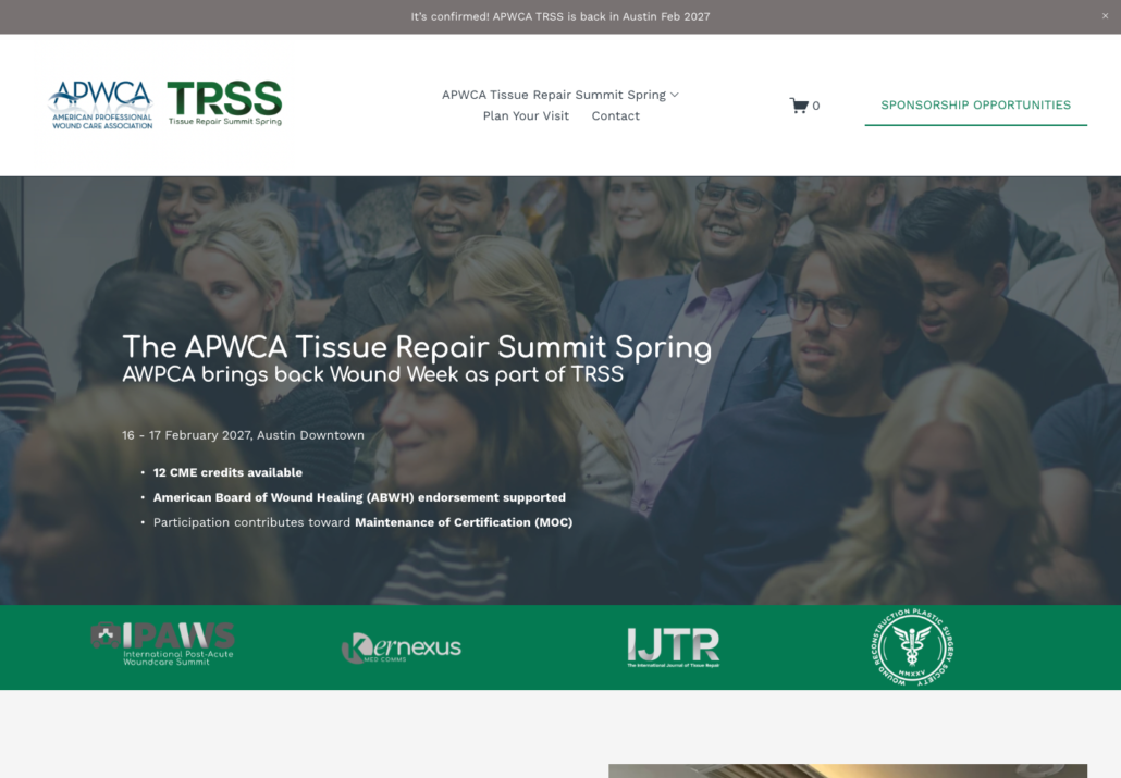
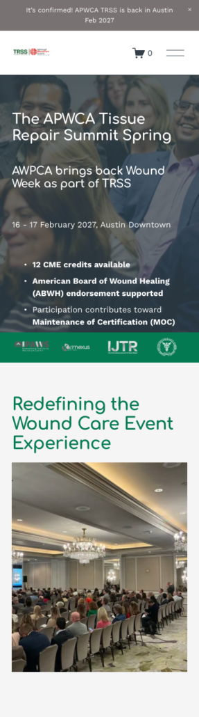
Desktop homepage before the redesign, captured 19 September 2026. The event name, accreditation messages and image-led banner dominated the opening view. Mobile views follow below in before-and-after order.
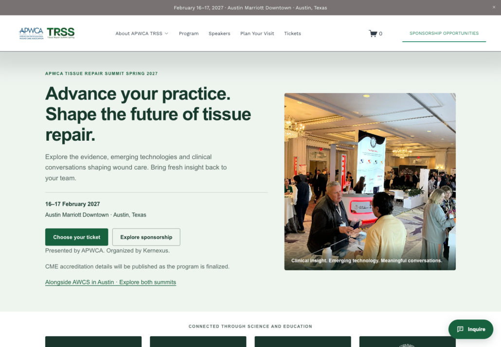
Desktop homepage after the redesign, captured 2 November 2026. A clear clinical proposition, practical event details and direct ticket and sponsorship actions lead the page.
We can map the bottleneck, prioritise what to fix first, and tell you honestly whether EKN is the right fit.

Needed for security, accessibility, and core site functionality. These are always on.